

Data Import
For this project, we will be using the tidyverse tool for data analysis. This is an R package that consists of tools such as ggplot2(data visualization),tidyr(data modification), dplyr (data management). The data set is obtained by calling the fivethirtyeight package using the command library(fivethirtyeight).
After calling the necessary libraries, we look at the structure of the data. The command str() allows us to get a brief summary of the data we are dealing with. This saves from displaying the entire dataset. A custom theme is set which will be used for all the graphs in this project.
library(tidyverse)
library(ggthemes)
library(scales)
library(stringr)
library(fivethirtyeight)
head(biopics)
str(biopics)
plotTheme <- function(base_size = 12) {
theme(
text = element_text( color = "black"),
plot.title = element_text(size = 10,colour = "black",hjust=0.5),
plot.subtitle = element_text(face="italic"),
plot.caption = element_text(hjust=0),
axis.ticks = element_blank(),
panel.background = element_blank(),
panel.grid.major = element_line("grey80", size = 0.1),
panel.grid.minor = element_blank(),
strip.background = element_rect(fill = "grey80", color = "white"),
strip.text = element_text(size=12),
axis.title = element_text(size=8),
axis.text = element_text(size=8),
axis.title.x = element_text(hjust=1),
axis.title.y = element_text(hjust=1),
plot.background = element_blank(),
legend.background = element_blank(),
legend.title = element_text(colour = "black", face = "bold"),
legend.text = element_text(colour = "black", face = "bold"))
}
The data consists of 14 variables(columns) and 764 observations(rows). We will dive deeper into the data by asking ourselves a few questions about
1. Frequency of Biopics Across the Years
2. Data Visualization by Gender, Subject and Colored/Non-Colored protaganist
3. Box Office Earnings
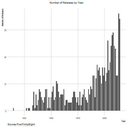
Number of Biopics Released by Year
biopics %>% group_by(year_release) %>% summarise(n=n()) %>%
ggplot(aes(x=year_release,y=n))+geom_bar(stat = "identity")+plotTheme()+
labs(x="Year",y="Number of Releases",title="Number of Releases by Year",
subtitle="",
caption="Source:FiveThirtyEight")
The number of biopics have been increasing.
Colored and Non Colored
% Wise Plot
poc <- biopics %>% group_by(year_release,person_of_color) %>% summarise(n=n()) %>%
mutate(person_of_color=ifelse(person_of_color==0,"Not Person of Color","Person of Color")) %>% mutate(n=n/sum(n))

ggplot(data = poc, aes(x = year_release, y = n*100, fill = person_of_color)) +
geom_bar(data = subset(poc, person_of_color=="Not Person of Color"),
stat = "identity") +
geom_bar(data = subset(poc, person_of_color=="Person of Color"),
stat = "identity",
position = "identity",
mapping = aes(y = -n*100)) +
scale_y_continuous(labels = abs) +
labs(x="Year",y="%",title="Bar Plot Visualization",
subtitle="% of Biopics that Feature Colored/Non Colored Characters",
caption="Data from FiveThirtyEight")+coord_flip()+plotTheme()

Frequency of Movies Involving White and Persons of Color
biopics %>% mutate(person_of_color=ifelse(person_of_color==0,"Not Person of Color","Person of Color")) %>% group_by(year_release,person_of_color) %>% summarise(n=n()) %>%
ggplot(aes(x=year_release,y=n,colour=person_of_color))+
geom_line()+plotTheme()+geom_vline(xintercept=1964,linetype=2)+labs(x="Year",y="Number",title="Number of Biopics White Actors/Actors of Color",
subtitle="",
caption="Data from FiveThirtyEight")+geom_text(aes(1964,0),label="Civil Rights' Act",show.legend = F,hjust=-1,angle=90,vjust=1,inherit.aes = F)+geom_vline(xintercept=1974,linetype=2)+geom_text(aes(1974,0),label="First Successful African American Sitcom",show.legend = F,hjust=0,vjust=1,,angle=90,inherit.aes = F)

The vertical dashed line above indicates the year 1964, when the Civil Rights’ Act was passed. The number of biopics depicting colored persons went up in the 1970’s. The first successful African American themed sitcom was released in the year 1974 (“Good Times”).
Gender Wise
How many biopics have there been portraying each gender?
biopics %>% group_by(year_release,subject_sex) %>% summarise(n=n()) %>% rename(gender=subject_sex) %>%
ggplot(aes(x=year_release,y=n,colour=gender))+geom_line()+ plotTheme()+labs(x="Year",y="Number",title="Number of Biopics By Gender",
subtitle="",
caption="Data from FiveThirtyEight")+scale_x_continuous(breaks = seq(1920,2014,5))+theme(plot.title=element_text(size=18),axis.text.x = element_text(angle=90, vjust=1))

Change in the number of movies from previous years
Before we start plotting the data, we have to replace empty values with a zero. For that purpose we modify the data using the gather and dcast functions . These functions help us to reshape the data and assign values.
library(tidyr)
library(reshape2)

year_wise <- biopics %>% group_by(year_release,subject_sex) %>% summarise(n=n()) %>% dcast(subject_sex~year_release,value.var="n") %>% gather(year,value,2:87) %>% mutate(value=ifelse(is.na(value),0,value)) %>%
dcast(subject_sex~year,value.var="value")
temp <- data.frame(gender=c("female","male"))

for(i in 3:87)
{

temp<- cbind(temp,(year_wise[,i]-year_wise[,i-1]))
}

colnames(temp)<- c("subject_sex", "1927", "1929", "1930", "1933", "1934",
"1935", "1936", "1937", "1938", "1939", "1940", "1941", "1942",
"1943", "1944", "1945", "1946", "1947", "1948", "1949", "1950",
"1951", "1952", "1953", "1954", "1955", "1956", "1957", "1958",
"1959", "1960", "1961", "1962", "1963", "1964", "1965", "1966",
"1967", "1968", "1969", "1970", "1971", "1972", "1973", "1974",
"1975", "1976", "1977", "1978", "1979", "1980", "1981", "1982",
"1983", "1984", "1985", "1986", "1987", "1988", "1989", "1990",
"1991", "1992", "1993", "1994", "1995", "1996", "1997", "1998",
"1999", "2000", "2001", "2002", "2003", "2004", "2005", "2006",
"2007", "2008", "2009", "2010", "2011", "2012", "2013", "2014"
)

temp %>% gather(year,value,2:86) %>%
ggplot(aes(x=as.numeric(year),y=value))+geom_line()+ plotTheme()+
labs(x="Year",y="Number",title="Change in Number of Biopic Movies From Previous Year",
subtitle="",
caption="Data from FiveThirtyEight")+
facet_wrap(~subject_sex,scales = "fixed")+
scale_x_continuous(breaks = seq(1920,2014,5))+
theme(plot.title=element_text(size=18),axis.text.x = element_text(angle=90, vjust=1))
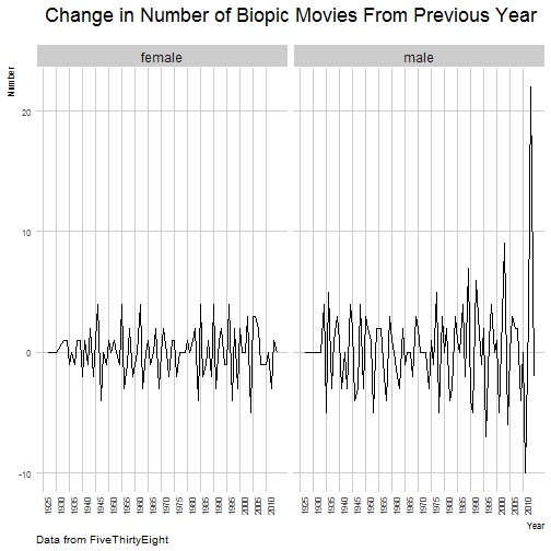
The change in the number of biopics that had male subjects shot up in 2014.
What kind of subjects do movies about male and female protaganists deal with?
biopics$type_of_subject <- gsub(" ","",biopics$type_of_subject)
biopics <- biopics %>%
mutate(type_of_subject = strsplit(as.character(type_of_subject), "/")) %>%
unnest(type_of_subject)
biopics$type_of_subject <- tolower(biopics$type_of_subject)
women_percent <-biopics %>% filter(subject_sex=="Female") %>% group_by(type_of_subject) %>% summarise(n=n()) %>% mutate(percent_women=n/sum(n))
men_percent <- biopics %>% filter(subject_sex=="Male") %>% group_by(type_of_subject) %>% summarise(n=n()) %>% mutate(percent_man=n/sum(n))

percent_overall <- full_join(women_percent,men_percent,by="type_of_subject") %>% select(-c(n.x,n.y)) %>%
mutate(percent_women = ifelse(is.na(percent_women),0,percent_women),percent_man=ifelse(is.na(percent_man),0,percent_man))
ggplot(percent_overall, aes(x = percent_women, y = percent_man, color = abs(percent_women - percent_man))) +
geom_abline(color = "gray40", lty = 2) +
geom_jitter(alpha = 0.1, size = 1, width = 0.3, height = 0.3) +
geom_text(aes(label = type_of_subject), check_overlap = TRUE, vjust = 1.5) +
scale_x_continuous(labels = percent_format(),limits = c(0,0.322)) +
scale_y_continuous(labels = percent_format(),limits=c(0,0.322)) +
scale_color_gradient( low = "red", high = "gray75") +
theme(legend.position="none") +
labs(y = "Biopics Involving Men", x ="Biopics Involving Women",text=element_text(size=10),plot.title=element_text(hjust=0.5))+ggtitle("Relative Frequency of Subjects(Gender Wise)")
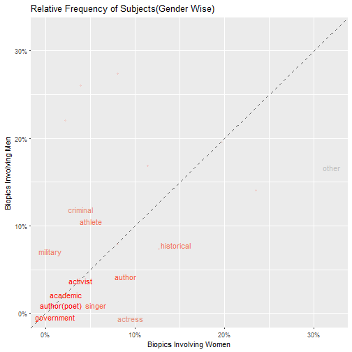
Topics that are close to the line indicate that these topics have similar frequencies in both the sets of data. These topics include government,academic and activist. Topics that are far from this line are topics that are found frequently in one set but not the other.For example,a larger percentage of biopics that involved women portrayed authors. By looking at the other side, topics like military had a higher percentage of coverage in biopics involved men than women.
Race and Gender
biopics %>% mutate(cuts=cut(year_release,breaks=5,label=c("1910-1930","1930-1950","1950-1970","1970-1990","1990-2010")))%>% group_by(cuts,subject_sex,subject_race)%>% filter(subject_race!="") %>%
summarise(n=n()) %>%
mutate(n=n/sum(n)) %>%
ggplot(aes(x=cuts, y=n*100, fill=subject_race)) +
geom_bar(stat="identity", position="dodge",width = 0.7)+plotTheme()+ylab("%")+ggtitle("Gender and Race")+theme(plot.title = element_text(hjust = 0.5))+xlab("Year")+scale_fill_manual(values = c("#24576D", "#A113E2",
"#000000", "#D91460",
"#28AADC",
"#40cc49",
"#F2583F",
"#96503F","#ffc100","#918d58","#e98000","#d2f4d2","#cdc8b1","#7c3838","#1fffaf","#a87582","#5b9c31"))+facet_grid(subject_sex~.)+theme(plot.title=element_text(size=18),axis.text.x = element_text(angle=90, vjust=1))+labs(caption="Data From FiveThirtyEight")

Most of the biopics depict white actors followed by African Americans.
Directors and Lead Actors(Decade Wise)
library(igraph)
library(ggraph)
library(gganimate)

g <- biopics %>% mutate(time_period=cut(year_release,breaks=11,label=c("1910-1920","1920-1930","1930-1940","1940-1950","1950-1960","1960-1970","1970-1980","1980-1990","1990-2000","2000-2010","2010-2014"))) %>% group_by(director,lead_actor_actress,time_period) %>% summarise(n=n()) %>% graph_from_data_frame()

directors <- levels(as.factor(biopics$director))

V(g)$class <- rep("",gorder(g))

for(i in 1:gorder(g)){
V(g)[i]$class <- ifelse(V(g)[i]$name %in% directors,"Directors",V(g)[i]$class)
}

for(i in 1:gorder(g)){
V(g)[i]$class <- ifelse(V(g)[i]$class=="","Actor",V(g)[i]$class)
}
#
# scale_edge_fill_manual(values = c("#94edc7","#180228","#010d5c","#ef1c17","#908b5b","#f3b893","#3c5e34","#91a5ae","#ff33dd","#ff947b","#cd0000"))
#
# values = c("#94edc7","#180228","#010d5c","#ef1c17","#908b5b","#f3b893","#3c5e34","#91a5ae","#ff33dd","#ff947b","#cd0000")

set.seed(100)
p <- ggraph(g, layout = 'kk') +
geom_edge_link(aes(colour = (time_period))) +
geom_node_point(aes(shape = class))+scale_edge_color_manual(values = c("#94edc7","#180228","#010d5c","#ef1c17","#908b5b","#f3b893","#3c5e34","#91a5ae","#ff33dd","#ff947b","#cd0000") )

p+ggtitle("Director and Actor Network by Decade")+theme(plot.title = element_text(hjust=0.5))+theme_graph()
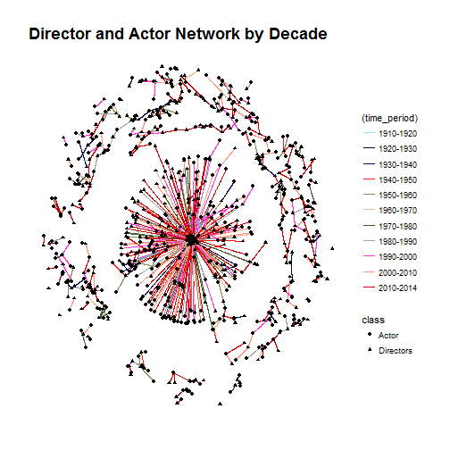
For the above plot, we use the ggraph library by Thomas Lin Pedersen. Using the scale_edge_color_manual() function, we set the the colors for each time period.
Animated Graph(Without Cumulative Background)
set.seed(100)

theme_set(theme_bw())
p <- ggraph(g, layout = 'kk') +
geom_node_point(aes(color = class,shape=class)) +
geom_edge_link0(aes(frame=time_period),edge_colour="#D91460",repel=T)+ggtitle("Directors and Actors Involved in Biopics By Decade")+theme_graph()+theme(plot.background = element_rect(fill = '#ffffff'),
panel.background = element_blank(),
panel.border = element_blank(),
plot.title = element_text(color = '#cecece',hjust=0.5,size = 8),legend.title = element_text(color="#ffffff"),legend.text=element_text(color="#ffffff"))

gganimate(p,"animated_graph_without_cumulative.gif")

Animated Graph With Cumulative Background
set.seed(100)

theme_set(theme_bw())

p <- ggraph(g, layout = 'kk') +
geom_edge_link(aes(cumulative=T),edge_alpha=0.2)+
geom_edge_link0(aes(frame=time_period,colour=time_period))+
scale_edge_color_manual(values=c("#94edc7","#180228","#010d5c","#ef1c17","#908b5b","#f3b893","#3c5e34","#91a5ae","#ff33dd","#ff947b","#cd0000"))+
geom_node_point(aes(shape = class,color=class))+ggtitle("Director and Actor Network for Biopics by Decade")+theme(plot.title = element_text(hjust=0.5))+theme_graph()
#animation::ani.options(ani.width=900)
gganimate(p,"animated_with_cumulative_background.gif")

Box Office Information
The box office information suggests how successful the movie was. In this section, we are not taking into account the factor of inflation.
Distributions of earnings per year
biopics %>% filter(box_office!="-") %>% mutate(box_office=gsub("$","",box_office,fixed=T)) %>%
mutate(denom=str_sub(box_office,nchar(box_office),nchar(box_office))) %>%
mutate(box_office=gsub("M","",box_office))%>%
mutate(box_office=gsub("K","",box_office)) %>%
mutate(box_office=as.numeric(box_office)) %>%
mutate(box_office=ifelse(denom=="M",box_office*1000000,box_office*1000)) %>%
ggplot(aes(x=as.factor(year_release), y=box_office)) + geom_boxplot() +
stat_summary(fun.y="mean", geom="point", shape=23, size=2, fill="white")+plotTheme()+
labs(title="Distributions of Earning Per Year",x="Year",y="$",subtitle="Inflation not taken into account(Diamond Point Represents Mean)",caption="Data From FiveThirtyEight")+facet_wrap(~subject_sex,ncol=1)+theme(axis.text.x = element_text(angle=90,vjust=1))
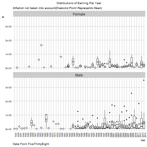
A large number of movies earned below USD100M.As we progress through the 80's, these numbers go higher , especially in the case of biopics based on men. The highest earning movie based on a female protaganist was released in 1964.This was the "Sound of Music" which earned approximately USD163M.
How do the distributions of box office earnings change by gender?
biopics %>% filter(box_office!="-") %>% mutate(box_office=gsub("$","",box_office,fixed=T)) %>%
mutate(denom=str_sub(box_office,nchar(box_office),nchar(box_office))) %>%
mutate(box_office=gsub("M","",box_office))%>%
mutate(box_office=gsub("K","",box_office)) %>%
mutate(box_office=as.numeric(box_office)) %>%
mutate(box_office=ifelse(denom=="M",box_office*1000000,box_office*1000)) %>%
ggplot(aes(x=subject_sex, y=box_office,fill=subject_sex)) +
geom_violin(color = "grey50")+
xlab("Box Office") + ylab("Count") +
stat_summary(fun.y="mean", geom="point", size=2, colour="white") +
plotTheme() + theme(legend.position="none")+
labs(x="Gender",y="($)",title="Distributions of Box Office Earnings",
subtitle="Inflation Not Taken into Account",
caption="Source: FiveThirtyEight")
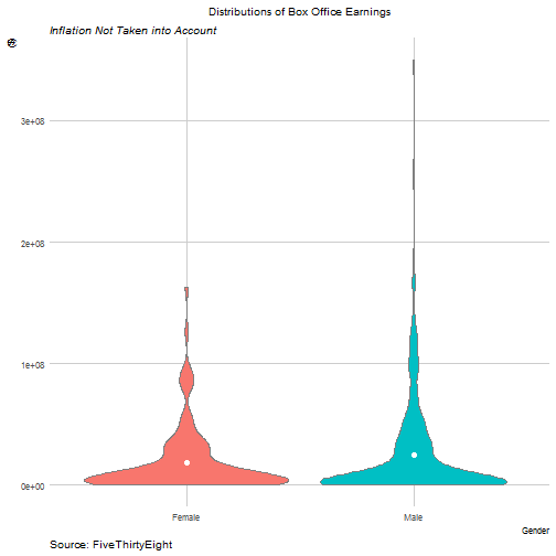
The mean earning is a little higher for biopics with male actors. The mean is higher probably due to the outliers present.
Person of Color/Not Person of Color
biopics %>% filter(box_office!="-") %>% mutate(box_office=gsub("$","",box_office,fixed=T)) %>%
mutate(denom=str_sub(box_office,nchar(box_office),nchar(box_office))) %>%
mutate(box_office=gsub("M","",box_office))%>%
mutate(box_office=gsub("K","",box_office)) %>%
mutate(box_office=as.numeric(box_office)) %>%
mutate(box_office=ifelse(denom=="M",box_office*1000000,box_office*1000)) %>%
ggplot(aes(x=as.logical(person_of_color), y=box_office,fill=as.factor(person_of_color))) +
geom_violin(color = "grey50")+
xlab("Person of Color") + ylab("Count") +
stat_summary(fun.y="mean", geom="point", size=2, colour="white") +
plotTheme() + theme(legend.position="none")+
labs(x="Person of Color",y="($)",title="Distributions of Box Office Earnings",
subtitle="Inflation Not Taken into Account",
caption="Source: FiveThirtyEight")
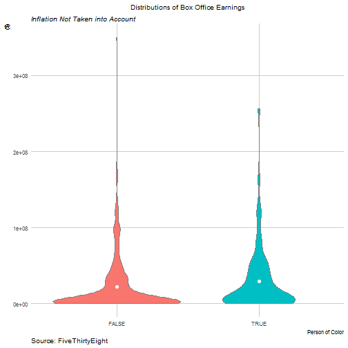
More number of movies with protaganists of color earned higher in the box office. This is probably why the average box office earnings are higher.
Results
- We see that there are more movies depicting non colored protaganists than colored protaganists
- Biopics based on male characters tend to be more military and sports themed.
- The biopics pertaining to non colored main characters shot up after 1974.
- The highest grossing biopics based on a woman is The Sound of Music.
- Biopics involving main characters of color earned higher on average in the box office.
